ABOUT 55

Marc Keyrouz is an abstract calligraphy artist, designer, animator, art director, photographer, and concept creator. Active since 2015, he created 55, a language that is based, according to the artist, on a limitless field of expressions shaped into forms and symbols relating to all visual transmissions that exist. His unique bold script holds a purposeful story.

WHY THE NAME ‘55’?

he name itself represents a shocking event that Marc holds in his soul with a lot of sentimental value, and according to the artist, it is a way to cryptically communicate through visual art, science, and technology.

As an artist committed to revealing truths through his craft, he assures that the mask will soon lift, perhaps in the wake of his first exhibition. This anticipation adds a touching layer of sentiment, reflecting the artist’s respect for the journey towards revealing the hidden depths of his creation.

WHY THE MASK OF 55

The mask you see in 55’s artwork suggests something profound: he’s not the sole creator; it’s you, the viewer, who gives it meaning.

Your own life experiences shape how you think, how you behave, and what you feel, influencing how you interpret and connect with the art.

HOW/WHY 55 WAS BORN

he accumulation of suppressed self-expression and communication issues triggered a powerful blast of emotions in Marc, leading to the development of his own distinct language,
as through the early stages of adulthood, he had the urge to express himself in any way possible, aiming to deliver his vision and ideas about the reality we are forced to convey subconsciously.

Growing up, he was very fascinated by symbols and specifically by the concept behind hiding such powerful meaning within small shapes that we come across every day without ever noticing the power they hold.


“55 is built on the original designs which integrate the blueprint of all creation: psychology of shapes, golden ratio, and sacred geometry are all part of
55 script.”

Losing something significant associated with the number 55 inspired him to delve deeper into the quest for life’s meaning.

ORPHAN COLLECTION

The debut collection, “Orphans,” embodied a pivotal experimental phase in artistic style, exploring various techniques such as splashes, UV paint, and bleach.

“Orphans” embraced a wide range of creative mediums, including photography, body paint, performance art, music, and collaborations. Its objective was to delve into diverse methods of visual communication within the framework of 55.

From this initial experimentation, new collections naturally emerged, each building upon the insights gained during the “Orphans” phase. This progression led to the creation of chapters I and II. Every collection was once an orphan until it found its home.

This ongoing evolution plays a critical role in shaping the foundation for future collections, consistently pushing boundaries and fostering innovation within the realm of 55 visual communication.

CHAPTER I COLLECTION

The Chapter I collection is inspired by the golden ratio, a mathematical concept fundamental to the universal harmony it embodies. This alignment is believed to contribute to the visual balance and symmetry that humans naturally find appealing.

Additionally, Chapter I draws inspiration from psychological tests and human patterns. Participants choose symbols, revealing subtle yet distinct personality patterns. Our everyday choices reflect these patterns, showing our interconnectedness.

Chapter I is a collection of seven powerful designs, symbolizing strength. These shapes stand as steel monuments across six of Lebanon’s wonders, equipped with QR codes for more information. Our goal is to spread these symbols globally and create new ones for heritage sites worldwide.

CHAPTER II COLLECTION

As Marc explored life’s complexities, he realized that everything in our world is deeply connected, from animals to humans to plants. This understanding inspired his third collection, “Chapter II,” where each piece reflects on the search for meaning in the face of loss and the pursuit of knowledge within our living environment.

Driven by his search Marc studied various subjects: the laws of the jungle, life cycles, metamorphosis, organ function, animal communication, and adaptation. These topics reveal the intricate workings of existence, from predator-prey dynamics to adaptation to changing environments.

Through Chapter II, 55 illustrates how all elements of existence are are interconnected and influence each other’s evolution and adaptation over time.

Understanding

the Symbols:

THE CREATION

As a child, the artist struggled to express and articulate through words. Articulation didn’t come easily, making it difficult for him to convey his thoughts and feelings. During this period, he became fascinated with symbols, simple shapes that seemed to hide deep meanings beneath their surface. He was intrigued by how these minimal forms could carry complex messages, often passed by unnoticed in everyday life.

This fascination led the artist to explore the golden ratio in his search for the reason behind his work. The golden ratio is a mathematical principle that he believes underlies the very structure of our world. It’s as if the universe itself was built using this formula, a blueprint that guides everything from the growth of plants to the construction of galaxies. Yet, humanity often overlooks this discovery, missing the opportunity to create structures that resonate with the harmony of the cosmos.

When the artist embarked on his journey to understand the meaning behind 55 and why he started this path, he was searching for answers—answers to life, to connection, to the way everything is intertwined.

Losing something without understanding its meaning drives us to seek answers, revealing that everything in life is connected. Our thoughts, behaviors, and decisions all form a web of interrelations. The concept of “thinking outside the box” isn’t truly out of the box; it’s a reflection of the patterns we live by.

His research led to the creation of an alphabet, a system of symbols designed to decode human patterns and behaviors. He drew inspiration from the Rorschach test, where people see different images in the same inkblot, depending on their emotional state, knowledge, and experiences. This test demonstrated how deeply personal interpretations can be, shaped by everything that makes us who we are.

In studying the Chapter I of 55, as shown in Figure 1, the artist asked participants to choose a symbol from a set that appeared almost identical. Despite their similarities, each person gravitated toward a specific symbol. Over 400 people participated in this study, and through in-depth conversations, subtle patterns emerged in their choices. Remarkably, 86% of the test participants showed consistent results.

These patterns reflected their backgrounds, desires, and aspirations, revealing a connection between their inner selves and the symbols they chose. This experiment was showcased in the Mother Superior Exhibition, where visitors were amazed at how a simple choice could unveil so much about their lives.

ENDULUM

dream boldly and inspire others with my magnetic charisma and undeniable power

SEV

I live for creating sounds, transforming every moment into a symphony, with each note revealing my passion.

LUV

I captivate with an irresistible allure, where sensuality flows through me like a mesmerizing dance.

HEXAE

I seek balance in all things, navigating the extremes with grace and determination.

PUOR

I nurture with unwavering warmth and care, pouring out boundless emotion and support.

UM

I embody calm and holiness, emanating peace and profound spiritual depth

KI V EN

I pursue health and adventure, fully embracing the richness of diverse cultures.

The Creation

of the Alphabet:

A UNIVERSAL LANGUAGE

The debut collection, “Orphans,” embodied a pivotal experimental phase in artistic style, exploring various techniques such as splashes, UV paint, and bleach.

“Orphans” embraced a wide range of creative mediums, including photography, body paint, performance art, music, and collaborations. Its objective was to delve into diverse methods of visual communication within the framework of 55.

From this initial experimentation, new collections naturally emerged, each building upon the insights gained during the “Orphans” phase. This progression led to the creation of chapters I and II. Every collection was once an orphan until it found its home.

This ongoing evolution plays a critical role in shaping the foundation for future collections, consistently pushing boundaries and fostering innovation within the realm of 55 visual communication.

MUSEU INSIDE
A MUSEUM

Bringing Abstract Art into the Spotlight in Lebanon
The “A Museum Inside a Museum” project was conceived to bring new and abstract art into the spotlight in Lebanon, where such art often faces resistance. In a society where emerging artists and unconventional ideas struggle for acceptance, many creators find their work commercialized to fit societal norms. This project aimed to change that narrative by integrating modern art with Lebanon’s rich heritage.

Installation of Symbols at Lebanon’s Heritage Sites
The initiative began with the installation of seven symbols at key heritage sites, representing the seven wonders of Lebanon: the Cedars of God, Baalbek Roman Ruins, Anjar Citadel, Byblos Phoenician Castle, Wadi Kadisha, and Tyre Hippodrome. These symbols were chosen to connect

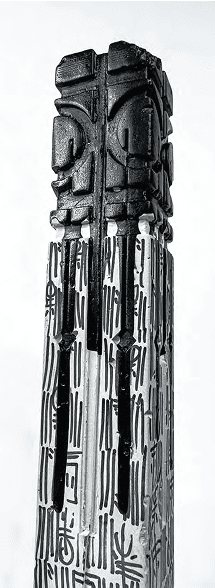
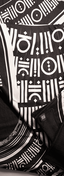
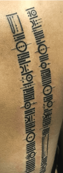
deeply with Lebanon’s history and culture, with each symbol linked to a specific site. The goal was to highlight the significance of these locations and foster a deeper appreciation for both the new art and the cultural heritage.

Proposal for Display in Beirut’s Green Zone
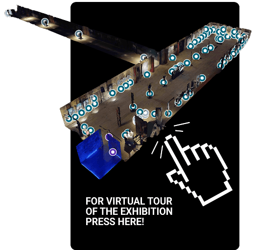
Initially, the project was proposed to be displayed in Beirut’s Green Zone, a symbolic location reflecting national unity. The statues were designed to align with the heritage sites they represent, and QR codes were included to provide contextual information. Funded personally by the artist, the project was set up for eight months, showcasing the new art while emphasizing the protection of Lebanon’s roots.

International Ambitions and Diplomatic Connections
The project gained further recognition when Marc Keyrouz

successfully presented it to the Minister of Culture, who approved the installation of the statues in these heritage sites. This marked the first time modern statues were integrated into Lebanon’s historical sites. Over the course of 1.5 years, Marc built connections with various international ambassadors, including those from Japan, Spain, and Italy.

Expansion Plans and Challenges
In 2023, Marc proposed extending the project to Japan, aiming to bring Lebanese heritage to a global audience and attract more tourists to Lebanon. Although the idea was approved by the Minister of Culture, it was ultimately halted due to the collapse of the Lebanese government. Despite this setback, the artist remains committed to expanding the project and developing new symbols that reflect global heritage sites.

THE MOTHER SUPERIOR: THE
FIRST MAJOR 55 EXHIBITION

Mother Superior represents a culmination of years navigating the intricate pathways of art and expression.

Emerging from the underground world of street art, it symbolizes a journey of transformation and resilience. At its core, Mother Superior is about unity, we are all one. This concept is woven into every aspect of the exhibition, merging words and visuals to convey profound meaning and stir emotion. The artist crafted a language that transcends communication, diving deep into the realms of psychology and untapped potential, uniting us all under a shared experience.

The exhibition featured a significant collaboration, with 30% of the artwork resulting from a creative partnership between 55 and rising artists in Lebanon. These emerging talents merged their unique styles with the 55 direction, integrating its symbols into their artistic expressions. This collaboration not only showcased the diversity of contemporary art but also emphasized the shared vision of unity that lies at the heart of Mother Superior. Through this fusion of styles, the exhibition highlighted the interconnectedness of different artistic voices, creating a harmonious blend that resonated with the exhibition’s overarching message.

THE LOCATION
Union Marks, once an abandoned sewing factory, now stands as a symbol of change and timelessness. After years of neglect, its transformation into a creative hub resonates with the spirit of 55. Choosing Union Marks as our exhibition venue was a thoughtful decision, reflecting the essence of 55’s journey from obscurity to cultural significance. When you enter Union Marks, you feel a sense of timelessness, like stepping into the heart of 55’s artistic world. The space itself is a work of art, with a long hallway, building excitement as you venture deeper. Modern yet echoing its industrial past, the main room creates a cinematic atmosphere. Every detail, from the rough walls to the wooden floors, fits perfectly with 55’s style. Our discovery of a numerical correlation and harmony between the basis of how 55 was discovered, and the perimeter, coordinates, and architectural details of the location, strengthened the connection between 55 and Union Marks and highlighted the importance of this space.

The exhibition was put together in just two days. On the opening day, the mood was carefully set to draw visitors into the 55 story. Waiters, wearing 55 masks, served champagne, adding to the unique atmosphere. The space had a 50-meter hallway with three stops, where pillars shared the background and meaning of 55, and why this location was chosen.
As people walked through, they experienced the 55 story with music that added hidden layers of meaning. At the end of the hallway, a 4×8 meter projector screen showed a detailed 3D animation. This animation featured the Mother Superior character, who told the 55 story using sign language.

After the hallway, visitors entered a large room. On the left side was the Chapter 2 collection, while the right side had the Chapter 1 collection and a UV room. In the middle of the room, smaller statues made from gold, copper were displayed, along with a psychology test

created by the artist. The UV room was a 4×5 meter space
painted entirely with UV paint, containing a mirror and a message: “I can be the one seeing this as you can be the one crafting it.”

An AR experience was set up on the left side, along with a photography collection, collaboration pieces, description boards, and story panels. This side also displayed the Chapter 2 collection, the Sarsen27 collection, rug designs, and a large 2×2.5 meter canvas.

The exhibition ended with a painting called “Mejores Días” (“Better Days” in Spanish), symbolizing the artist’s journey through struggle.
The exhibition was very successful, with 76% of the items sold. Many collaborators showed interest in partnering with 55, and the event inspired a new generation of artists.

The 55 script is evolving and expanding its influence globally. As 55 members spread worldwide, they are bringing the 55 story and its unique direction to new audiences. The script is set to showcase its art across Europe and other regions, with upcoming exhibitions in galleries and the installation of statues that symbolize historical landmarks and convey powerful messages. These statues will incorporate gold, rare materials, and precious stones, adding an elite touch to the creations. Collaborations with jewelry experts are underway, integrating the 55 script into the world of luxury. This new approach to art combines the underground with luxury, creating a fusion of symbolism and high-end design. Two documentaries are currently in production, capturing the essence of the 55 script. As more enthusiasts and experts join the movement, the message that “humans die, but ideas live forever, changing lives and perspectives” continues to resonate strongly. We are one.


So, who is 55? It’s not me. I’m just the messenger delivering this message.

Contact Us

Contact us

GALLERY

STORE

ABOUT